
“Numbers don’t lie, but they sure can mislead.” You’ve probably heard this before, and in the world of statistics, it couldn’t be more accurate. People often hail averages as the go-to statistic for summarizing data, but here’s the catch: if you rely on averages without digging deeper, you might miss the true story or, worse, draw misleading conclusions.
But Why? That’s exactly what I’ll be addressing in this article. I’ll break it down as clearly as possible, using simple definitions and plenty of examples to make everything easier to understand.
What Are We Really Looking At?
Let’s start by clarifying what we mean by “average.” The mean, which is the most common type of average, calculates by adding all the values in your dataset and dividing by the total number of values. Sounds simple, right? Well, it is—but it can still cause a lot of problems if we don’t use it properly.
When data is skewed or has outliers, the mean can hide important details. And here’s the catch—it doesn’t always give you an accurate picture of what’s really going on in your dataset. So what does that mean? Simply put, when you summarize your data, instead of getting a true, simplified picture, you might just end up seeing a pretty big lie on the screen.
Data That Shines from a Distance
We are calling them outliers, they are far from distant from other data and they can be less or higher than usual range and when they added up to average they can significantly effect the result.
Take, for example, a class of students who scored between 70 and 90 on a test, but one student scored 150. That 150 is an outlier. It’s not like the other scores, and it can drag the mean up, making the average score look higher than most students’ actual performance. The key takeaway here? The mean is sensitive to outliers, so if you ignore them, you might end up with a distorted view.
BUT! Outliers don’t necessarily indicate erroneous data; they can represent valid, real-world values. In practice, data rarely follows a perfect pattern—exceptions are common and expected. However, when summarizing data, it’s generally advisable to either exclude outliers or analyze them separately to avoid distorting the overall summary.
Skewed Data
Skewed data occurs when the values aren’t evenly distributed. For example, in a positively skewed (right-skewed) dataset, most of the scores are on the lower end, but there are a few exceptionally high values. This is common in income data, where most people earn in the lower range, but a few high earners pull the average up.

On the flip side, negatively skewed (left-skewed) data occurs when most values are higher, but a few low scores drag the average down. In both cases, the mean gets distorted by the outliers or the tail of the distribution, and it doesn’t accurately represent the “typical” value of the data.
Handling Outliers
Handle outliers with care because some can provide valuable insights for your analysis. Start by visualizing the outliers to understand their impact. Remove them only if absolutely necessary (and do so cautiously). Alternatively, cap the outliers to limit their influence without losing them entirely.
The first step in dealing with outliers is spotting them. A boxplot is a great tool for this. It gives you a visual summary of the data distribution, and any data points outside the “whiskers” are considered potential outliers.
Later, based on your analysis, you can decide whether to remove the outliers or cap them, depending on what best suits your data and goals.
Removing outliers might be necessary if they are clearly errors or if they could distort your results. On the other hand, capping outliers can be a good option when you want to limit their impact without completely discarding them, ensuring that the data still reflects real-world variability while preventing extreme values from skewing your analysis.
import numpy as np
import matplotlib.pyplot as plt
import seaborn as sns

np.random.seed(0)
data = np.random.normal(loc=50, scale=10, size=1000)

data_with_outliers = np.append(data, [200, 250, 300])

fig, axes = plt.subplots(1, 2, figsize=(12, 6))

sns.boxplot(data=data_with_outliers, ax=axes[0])
axes[0].set_title("Data with Outliers")

lower_limit = np.percentile(data_with_outliers, 5)
upper_limit = np.percentile(data_with_outliers, 95)
capped_data = np.clip(data_with_outliers, lower_limit, upper_limit)

sns.boxplot(data=capped_data, ax=axes[1])
axes[1].set_title("Capped Data (Outliers Removed)")

plt.tight_layout()
plt.show()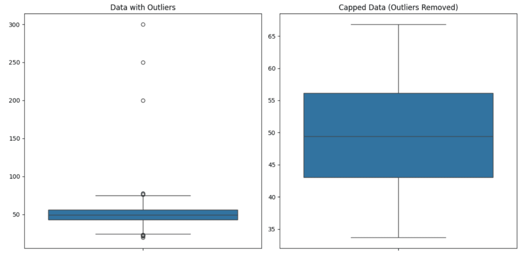
In the example above, we added a few outliers to a normally distributed dataset and visualized them using a boxplot.
Instead of removing the outliers, we capped them using the 5th and 95th percentiles. This way, the extreme values were limited to a reasonable range without completely removing them. The result is a cleaner dataset that’s still reflective of the overall distribution.
Handling Skewed Data
Skewed data is common in real-world scenarios. For example, income data often has a positive skew due to a few individuals earning much higher than the majority. Let’s simulate a right-skewed dataset in Python and visualize it.
import numpy as np
import matplotlib.pyplot as plt
import seaborn as sns

np.random.seed(0)
data = np.random.exponential(scale=100, size=1000)


sns.histplot(data, kde=True)
plt.title("Right-Skewed Distribution")
plt.show()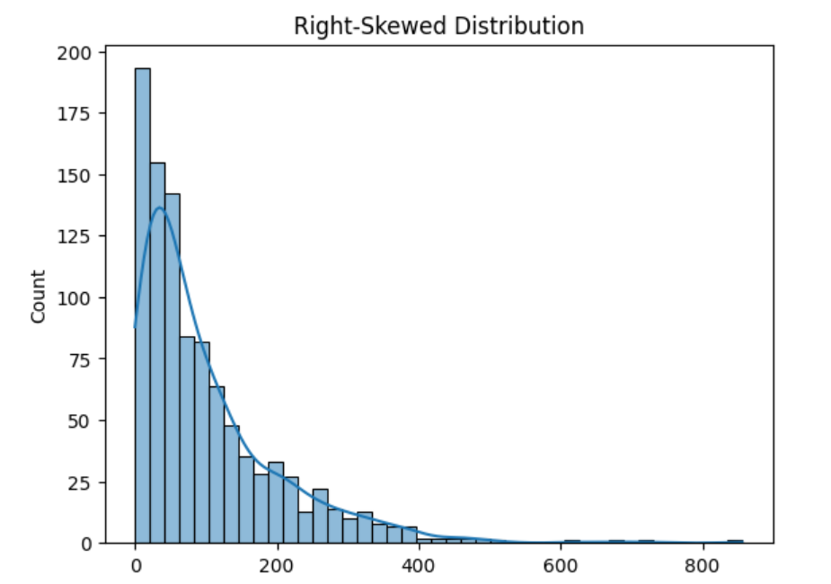
In this example, we used the exponential distribution to simulate a right-skewed dataset. The histogram and KDE (Kernel Density Estimate) plot show how most of the data is clustered on the lower end, with a long tail stretching to the right.
So, when your data is skewed, the mean might not accurately reflect the “typical” value. In these cases, you should consider using the median instead of the mean. Another approach is to apply a log transformation to reduce the skewness and make the data more normally distributed.
import numpy as np
import matplotlib.pyplot as plt
import seaborn as sns


np.random.seed(0)
data = np.random.exponential(scale=100, size=1000)


log_data = np.log(data + 1)

plt.figure(figsize=(10, 6))
sns.histplot(log_data, kde=True, color='salmon')
plt.title("Log-Transformed Data to Reduce Skewness")
plt.show()Log transformation basically helps by pulling in those big outliers and compressing the long right tail. It makes the data less skewed and more balanced. So, instead of having a few extreme values that mess up the mean, the log transformation evens things out, giving you a more accurate picture of what’s typical in the dataset. It’s a neat trick to help the data behave more normally and make your analysis more reliable.
The Simpson’s Paradox and How Averages Can Mislead
Simpson’s Paradox is when averages can make things seem completely different from what they actually are. Now imagine a study comparing two treatments for a medical condition. Treatment A has an 80% success rate for young adults and 30% for seniors. Treatment B has a 60% success rate for young adults and 50% for seniors.
Individually, Treatment A looks better for young adults and Treatment B is better for seniors. But when you combine all the data, the overall success rate might show Treatment B as the better option even though it’s not as good for young adults.
This paradox illustrates that averages can be misleading if you don’t examine the underlying details. The key takeaway is to always dig deeper into your data and not rely solely on averages.
How to Know When to Use the Average
Alright, so now you’re probably wondering when should you actually use the average or mean? Well, it really depends on the data you’ve got.
Here’s the thing, if your data is pretty balanced with no weird outliers or funky patterns, the average is your friend. It gives you a decent snapshot of the “typical” value in the set. Think of it like this, if you’re looking at the scores of a class, and most of the students scored around the same range, the mean will probably reflect the overall performance pretty well.
But, and it’s a big but, if your data has some extreme values or is skewed, relying on the mean can really mislead you (probably I said this several times in this article).
So, in short, if your data looks pretty normal and balanced, use the average. If not, it’s time to look for something more reliable.
Conclusion
We’ve talked a lot about how averages (especially the mean) can trick us if we’re not careful. Whether it’s due to outliers, skewed data, or the infamous Simpson’s Paradox, the mean isn’t always the trusty hero we think it is.
That’s why it’s so important to dig deeper before jumping to conclusions. In some cases, the median or a simple transformation like log scaling can tell you a much more accurate story. Also, remember that outliers aren’t always the bad guys, but they can throw things off if you’re not careful. Visualizing your data, checking for patterns, and considering your context will always help you make a better decision on how to handle these tricky bits.
The big takeaway here? Don’t just trust the average to tell you everything. Take the time to understand the nuances of your data, and you’ll get way better insights. It might take a little extra work, but it’s totally worth it in the end.