
At first, I prepared the whole article using pure Rust with Plotters and Polars, but the result wasn’t the best, and the workflow was difficult. I don’t think anyone should spend so much time on data visualization. So, I created a new version where I use D3.js for visualization but still use Polars for data processing.
I didn’t want to lose Rust’s speed, safety, and the power of Polars, but I was really frustrated by Rust’s visualization libraries. I’m not a fan of them, so that’s enough, I’m back to JavaScript for visualization.
But! I’ll still use Polars for data manipulation since it’s easy to work with and offers the best performance out there.
Dataset
I’m going to use the CO₂ emissions dataset from Our World in Data. It’s a simple dataset that you can find there.
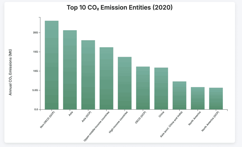
We will visualize the top 10 entities (excluding ‘World’) by CO₂ emissions. This isn’t a strict project, mostly a fun fan project and a way to showcase tools.
But you can’t imagine how much I struggled trying to visualize all of that in Rust, and still didn’t get great results. (Yes, maybe it’s my fault, but still.)
So today, I’m going back to my comfort tool, D3.js, for visualization!
Setup
cargo new co2_dash
cd co2_dash[dependencies]
polars = { version = "0.38", features = ["lazy" , "csv", "is_in"] }
serde = { version = "1.0", features = ["derive"] }
serde_json = "1.0"Create a new project and add dependencies to the TOML file.
co2_dash/
├── backend/
│   ├── Cargo.toml
│   ├── src/
│   │   ├── main.rs
│   └── data/
│       └── co2_data.csv
├── frontend/
│   ├── index.html
│   └── data/
│ └── top_emitters_2020.jsonYou can also create a project structure like that to make it easy to work with everything.
Data Processing with Rust
Let’s start processing the data. Currently, our dataset has two columns we don’t need: Code and Year.
We’ll also exclude the World entity for now, as well as any entries with 0 CO₂ emissions, since there’s no point in visualizing them.
For this first chart, we’ll focus only on data from 2020, because we want to visualize that year specifically.
Finally, we’ll sort the data in descending order before visualization.
use polars::lazy::prelude::*;
use polars::prelude::*;
use serde_json::to_writer_pretty;
use std::error::Error;
use std::fs::File;

fn top_emitters(lf: &LazyFrame, year: i32) -> PolarsResult<DataFrame> {
    let result = lf
        .clone()
        .filter(
            col("Annual CO₂ emissions")
                .gt_eq(1)
                .and(col("Entity").eq(lit("World")).not())
                .and(col("Year").eq(lit(year))),
        )
        .select([col("Entity"), col("Annual CO₂ emissions")])
        .sort(
            "Annual CO₂ emissions",
            SortOptions {
                descending: true,
                ..Default::default()
            },
        )
        .collect()?;

    Ok(result)
}

fn main() -> Result<(), Box<dyn Error>> {
    let lf = LazyCsvReader::new("co2_data.csv")
        .has_header(true)
        .finish()?;

    let df = top_emitters(&lf, 2020)?;

    #[derive(serde::Serialize)]
    struct EntityEmission {
        entity: String,
        annual_co2_emissions: f64,
    }

    let entities = df.column("Entity")?.str()?;
    let emissions = df.column("Annual CO₂ emissions")?.f64()?;

    let mut records = Vec::with_capacity(df.height());
    for (entity_opt, emission_opt) in entities.into_iter().zip(emissions.into_iter()) {
        if let (Some(entity), Some(emission)) = (entity_opt, emission_opt) {
            records.push(EntityEmission {
                entity: entity.to_string(),
                annual_co2_emissions: emission,
            });
        }
    }

    let file = File::create("top_emitters_2020.json")?;
    to_writer_pretty(file, &records)?;

    Ok(())
}
So, we grabbed this heavy CO₂ dataset, full of noise, years we don’t care about, global totals, and zero-emission entries just taking up space.
In Rust, with Polars, we sliced through it. Focused only on 2020, because that’s where we wanted to aim our lens first.
Cleaned it, sorted it top-down by who pumped out the most emissions, and prepped it for the frontend.
{ "entity": "China", "annual_co2_emissions": 10500000.0 }Once we had it, we packed it into a neat JSON file, you can see part of it in the code block above. No clutter, no BS. Just raw, structured data, ready to be picked up by D3.js for visualization.
In-Depth Breakdown
If you like step-by-step explanations, you can find them here, but it’s really just a more detailed breakdown of what we already covered above.
fn top_emitters(lf: &LazyFrame, year: i32) -> PolarsResult<DataFrame> {
    let result = lf
        .clone()
        .filter(
            col("Annual CO₂ emissions")
                .gt_eq(1)
                .and(col("Entity").eq(lit("World")).not())
                .and(col("Year").eq(lit(year))),
        )
        .select([col("Entity"), col("Annual CO₂ emissions")])
        .sort(
            "Annual CO₂ emissions",
            SortOptions {
                descending: true,
                ..Default::default()
            },
        )
        .collect()?;

    Ok(result)
}We began by loading the CO₂ dataset using Polars’ lazy API, which allowed us to build a performant query pipeline without immediately executing anything.
Our focus was the year 2020, so we filtered the data accordingly. To keep things relevant, we excluded entries labeled “World” and any rows where emissions were zero or less.
After narrowing the dataset to just the “Entity” and “Annual CO₂ emissions” columns, we sorted the data in descending order to highlight the top emitters.
fn main() -> Result<(), Box<dyn Error>> {
    let lf = LazyCsvReader::new("co2_data.csv")
        .has_header(true)
        .finish()?;

    let df = top_emitters(&lf, 2020)?;

    #[derive(serde::Serialize)]
    struct EntityEmission {
        entity: String,
        annual_co2_emissions: f64,
    }

    let entities = df.column("Entity")?.str()?;
    let emissions = df.column("Annual CO₂ emissions")?.f64()?;

    let mut records = Vec::with_capacity(df.height());
    for (entity_opt, emission_opt) in entities.into_iter().zip(emissions.into_iter()) {
        if let (Some(entity), Some(emission)) = (entity_opt, emission_opt) {
            records.push(EntityEmission {
                entity: entity.to_string(),
                annual_co2_emissions: emission,
            });
        }
    }

    let file = File::create("top_emitters_2020.json")?;
    to_writer_pretty(file, &records)?;

    Ok(())
}Once the data was prepared, we converted each record into a structured format and exported it as a clean, readable JSON file.
This final output is optimized for use in data visualizations, particularly with D3.js, and ensures our workflow remains both fast and maintainable.
If you are new to serde and the other tools used here, please check out the Polars article for a quick introduction, and read this article for an introduction to serde.
Visualizing
Now that we have a JSON file, it’s time to visualize everything. We’ll create an HTML file and build out the full project to display the top 10 CO₂-emitting countries.
You can split the code into JS, CSS, and HTML as usual. If you’ve worked on frontend development before, you’ll find D3.js easy to use for these visualizations.
<!DOCTYPE html>
<html lang="en">
<head>
  <meta charset="UTF-8" />
  <meta name="viewport" content="width=device-width, initial-scale=1.0"/>
  <title>Top 10 CO₂ Emitters (2020)</title>
  <link rel="stylesheet" href="styles.css" />
</head>
<body>
  <h1>Top 10 CO₂ Emitters in 2020</h1>
  <div id="chart"></div>

  <script src="https://d3js.org/d3.v7.min.js"></script>
  <script src="script.js"></script>
</body>
</html>The HTML file is quite simple: you define a heading and a div for the chart. It’s also good practice to set the page’s language and character encoding (UTF-8), and later link your JavaScript and CSS files in the HTML.
body {
  font-family: system-ui, sans-serif;
  padding: 2rem;
  background-color: #f9f9f9;
  color: #333;
}

h1 {
  text-align: center;
  margin-bottom: 2rem;
}

#chart {
  max-width: 800px;
  margin: 0 auto;
}We’re not here to explain CSS in detail, but why not do a quick recap? We centered everything on the page, adjusted the chart’s width, added some padding, set a background color, and made a few other styling tweaks to make it look clean and readable.
D3.js Section
// Load the data
d3.json("data/top_emitters_2020.json").then((data) => {
  const margin = { top: 20, right: 30, bottom: 40, left: 150 };
  const width = 800 - margin.left - margin.right;
  const height = 500 - margin.top - margin.bottom;

  const svg = d3
    .select("#chart")
    .append("svg")
    .attr("width", width + margin.left + margin.right)
    .attr("height", height + margin.top + margin.bottom)
    .append("g")
    .attr("transform", `translate(${margin.left},${margin.top})`);

  // X scale
  const x = d3
    .scaleLinear()
    .domain([0, d3.max(data, (d) => d.annual_co2_emissions)])
    .nice()
    .range([0, width]);

  // Y scale
  const y = d3
    .scaleBand()
    .domain(data.map((d) => d.entity))
    .range([0, height])
    .padding(0.1);

  // X Axis
  svg
    .append("g")
    .attr("transform", `translate(0, ${height})`)
    .call(d3.axisBottom(x).ticks(5).tickFormat(d3.format(".2s")));

  // Y Axis
  svg.append("g").call(d3.axisLeft(y));

  // Bars
  svg
    .selectAll("rect")
    .data(data)
    .enter()
    .append("rect")
    .attr("x", 0)
    .attr("y", (d) => y(d.entity))
    .attr("width", (d) => x(d.annual_co2_emissions))
    .attr("height", y.bandwidth())
    .attr("fill", "#2c7be5");

  // Labels
  svg
    .selectAll(".label")
    .data(data)
    .enter()
    .append("text")
    .attr("x", (d) => x(d.annual_co2_emissions) + 5)
    .attr("y", (d) => y(d.entity) + y.bandwidth() / 2)
    .attr("dy", ".35em")
    .text((d) => d3.format(".2s")(d.annual_co2_emissions));
});We start by loading our JSON file using d3.json. That file, top_emitters_2020.json, was crafted earlier with Rust and Polars.
It holds clean, pre-processed data: top 10 CO₂ emitting countries from 2020. No bloat, no noise. Once loaded, we drop into a .then block to begin building our chart.
Before you can draw anything, you need to define your canvas. We define margin, width, and height, basically carving out a space where the actual chart will live inside the SVG.
This margin convention is standard in D3: it gives breathing room for labels and axes so your chart doesn’t feel like it’s gasping in a corner.
Next, we grab the chart container div (#chart) and append an SVG element to it. Then we add a <g> (group) element inside the SVG, and shift it using transform so everything lands inside the margins we just defined. That <g> will be the root of our visual tree.
We set up a linear x scale to map CO₂ values across the width, using d3.max to size it right and .nice() for clean ticks. The y scale is a band that stacks countries vertically with some padding for breathing room.
Axes come next, the x-axis at the bottom shows emissions with short formats like “10M”, and the y-axis labels each country on the left.
Then we draw the bars, starting from x=0 and stretching based on emissions. Each one gets a calm blue color and fits neatly into its row.
Finally, we drop in labels beside each bar, offset a bit for clarity, showing the actual numbers in a compact, readable way.
Phew, that’s all.
Conclusion
Okay, I agree Rust is really powerful but can be a pain in the ass to use for visualization, so I cheated and used D3.js for this task, please forgive me.
This article isn’t meant to be a step-by-step tutorial but more of a look at how to combine Rust and JavaScript in your workflow. It’s like, did you like the results I got with these tools, and would you consider using them yourself?
I hope you enjoyed what we did today and that you’ll consider this approach for your future projects.
By the morning, feel like magic.