
Numbers can be boring, but they don’t have to be. They’re beautiful when they start to look like something. Details create the big picture, and to build that picture, we need plots.
Plots are still essential tools in data science and anything involving data. In this article, I’ve prepared implementations of the three most commonly used plots in Rust, for anyone who wants to get started quickly.
Dependencies
[dependencies]
plotters = "0.3"Not much to do today, just add the plotters crate to your dependencies, and you’re ready to start.
Visualizing Trends
Line plots are great for showing changes over time or continuous data. For example, you can use a line plot to show house prices over 10 years.
use plotters::prelude::*;

fn main() -> Result<(), Box<dyn std::error::Error>> {

    let root = BitMapBackend::new("house_price.png", (640, 480)).into_drawing_area();
    root.fill(&WHITE)?;

    let mut chart = ChartBuilder::on(&root)
        .caption("House Prices Over 10 Years", ("sans-serif", 30))
        .margin(20)
        .x_label_area_size(40)
        .y_label_area_size(60)
        .build_cartesian_2d(1..10, 150_000..400_000)?;

    chart.configure_mesh()
        .x_desc("Year")
        .y_desc("Price ($)")
        .draw()?;

    let data = vec![
        (1, 200_000),
        (2, 210_000),
        (3, 220_000),
        (4, 230_000),
        (5, 250_000),
        (6, 270_000),
        (7, 290_000),
        (8, 310_000),
        (9, 330_000),
        (10, 350_000),
    ];

    chart.draw_series(LineSeries::new(
        data.into_iter(),
        &BLACK,
    ))?;

    Ok(())
}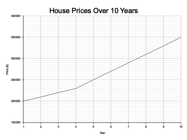
Essentially, a line plot is like a dot plot where all the dots are connected by lines, creating a continuous visual representation.
Okay, now let’s review what we did here. First, we created a canvas for our plot, saving it to the file house_price.png, and filled the canvas with white.
Next, we used a chart builder, which is essential for setting chart attributes like margin, caption, and labels for the X and Y axes.
After that, we added descriptions for the X and Y axes and drew the grid lines.
Finally, we drew a line series using the vector of data points we created. (By the way, the line will be black because that’s the color we specified.)
Comparing Points
Scatter plots are like line plots without the connecting lines. They are great for showing individual data points and are often used to examine the distribution of data.
They’re especially useful for showing the relationship between two variables, such as how changes in x correspond to changes in y.
use plotters::prelude::*;

fn main() -> Result<(), Box<dyn std::error::Error>> {
    let root = BitMapBackend::new("work_vs_job.png", (640, 480)).into_drawing_area();
    root.fill(&WHITE)?;

    let mut chart = ChartBuilder::on(&root)
        .caption("Work Time vs Job Done Percentage", ("sans-serif", 30))
        .margin(20)
        .x_label_area_size(40)
        .y_label_area_size(40)
        .build_cartesian_2d(0..10, 0..100)?;

    chart.configure_mesh()
        .x_desc("Work Time (hours)")
        .y_desc("Job Done (%)")
        .draw()?;

    let data = vec![
        (1, 10),
        (2, 25),
        (3, 40),
        (4, 55),
        (5, 65),
        (6, 75),
        (7, 85),
        (8, 90),
        (9, 95),
    ];

    chart.draw_series(
        data.iter().map(|&(x, y)| Circle::new((x, y), 5, GREEN.filled())),
    )?;

    Ok(())
}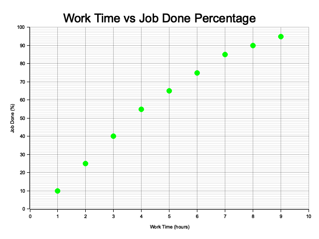
Instead of using LineSeries, you just need to use Circle to create a scatter plot; everything else is quite similar.
draw_series takes a data vector, then we use map to extract the x and y values and create circles at each (x, y) point with a size of 5 and filled in green.
chart.draw_series(
    std::iter::empty().chain({
        let mut circles = vec![];
        for &(x, y) in &data {
            circles.push(Circle::new((x, y), 5, GREEN.filled()));
        }
        circles.into_iter()
    })
)?;You can also think of it like a for loop, but since draw_series takes an iterable, you need to convert it to an iterator. So using map is a much better choice.
Now, you might think scatter plots are very similar to line plots, and it can be frustrating to understand why it matters to use one over the other.
I agree, but there is one key concept that makes them different: scatter plots visualize individual data points without implying a continuous connection between them.
They’re ideal for showing the distribution, clustering, or relationship between two variables, especially when the data points are discrete or irregularly spaced.
Imagine you have 13300 different data points, including some outliers and data points may be in same positions, in such cases, line plots are not ideal.
Line plots are great for connecting points with lines to emphasize trends or continuous changes over time or another continuous variable.
Category Comparisons
Bar plots are quite distinct, they belong to a completely different category than line and scatter plots. Bar plots are best suited for categorical data, not numerical data.
Scatter and line plots both work with numerical data, such as floats and integers. In contrast, bar plots are designed for categorical data, where the categories are often represented as strings.
For bar plots, I personally use charts-rs. It’s a personal choice, but I believe it’s an easier and better solution for bar plots. Please add charts-rs to your dependencies.
[dependencies]
charts-rs = "0.3.24"use charts_rs::{BarChart, THEME_DARK};
fn main() -> Result<(), Box<dyn std::error::Error>> {
let months = vec!["Jan", "Feb", "Mar", "Apr", "May", "Jun"]
.into_iter()
.map(String::from)
.collect::<Vec<_>>();
let expenses = vec![120.0, 150.0, 170.0, 200.0, 180.0, 160.0];
let mut bar_chart =
BarChart::new_with_theme(vec![("Expenses", expenses).into()], months, THEME_DARK);
bar_chart.title_text = "Bar Chart".to_string();
bar_chart.legend_show = Some(false);
std::fs::write("monthly_expenses.svg", bar_chart.svg()?)?;
Ok(())
}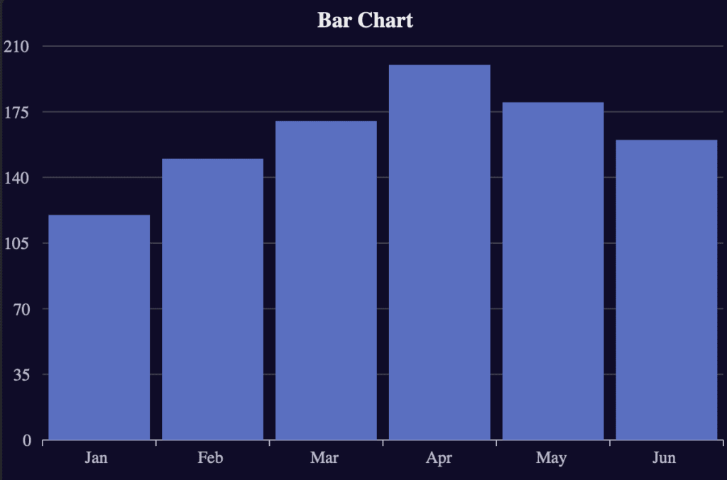
Charts-rs is not as mature as Plotters; however, it is improving, and its bar plots are significantly better than those in Plotters.
The syntax is simple, so there’s no need to worry about adapting. We created a vector of months, made it iterable, and collected it into a new vector. We also created a vector of expenses. Then, using Charts-rs, we passed the months and expenses into a BarChart with a theme and wrote the resulting chart to an SVG file.
Additionally, I removed the default legends and added a title to improve the appearance.
Conclusion
Rust for data visualization can be a bit challenging at first, but it’s actually quite simple, much like using Matplotlib.
I’ve used both Plotters and Charts-rs in my projects. That’s because Charts-rs makes bar plots easier to handle with less effort, while Plotters is more mature and well-suited for scatter and line plots.
However, it’s perfectly fine to do everything in a single crate, it’s all a matter of personal preference.
If you’re already working with Rust regularly, consider kicking off your data visualization projects in Rust, you’ll quickly find it’s not that hard to start drawing meaningful charts.
I go to ride ’till I die,die