
Again, I’m doing something that you can also do in Python, but due to my personal preferences, I’m building it in another language. Today, we are creating a game analytics dashboard with JavaScript.
I don’t care what people say; I still dislike Python, and that won’t change over the next decade. I don’t mind if it’s considered unprofessional; my choices come first!
If you want, find the full code here is my GitHub repo.
This article is prepared for quick introduction, so it’s best to have experience in JavaScript, HTML, and CSS.
But Why We Need Game Analytics Dashboard
To empower your services with data, you first need to analyze player behavior and game data. By doing so, you can improve gameplay, enhance mechanics, or update your game overall.
You can also track player count, nerf your Akali until she becomes a minion and much more. In fact, there are many things you can do with game data.
To effectively analyze this game data, you first need to gather and store it somewhere for faster analysis. Consequently, that’s exactly where the game analytics dashboard comes in.
Sample Data
However, for this project, we won’t have an already built game to provide data or a data pipeline to supply information to our dashboard.
Instead, we will create sample data in JSON format to use in our dashboard.
We can code something like an array of 44 (I like the number 4) sessions of players, which will contain an ID (similar to your Hoyoverse ID), a score, and the duration of each player’s session in the game.
function generatePlayerData(id) {
    return {
        id: id,
        score: Math.floor(Math.random() * 1000),
        duration: (Math.floor(Math.random() * 86400) / 3600).toFixed(2)
    };
}

const playerSessions = [];

for (let i = 1; i <= 44; i++) {
    playerSessions.push(generatePlayerData(`Player ${i}`));
}

console.log(playerSessions); [
{ Id: 'Player 1', Score: 592, Duration: '3.67' },
{ Id: 'Player 2', Score: 879, Duration: '16.45' },
{ Id: 'Player 3', Score: 116, Duration: '8.59' },
{ Id: 'Player 4', Score: 736, Duration: '0.47' },
{ Id: 'Player 5', Score: 301, Duration: '6.03' },
{ Id: 'Player 6', Score: 116, Duration: '12.01' },
{ Id: 'Player 7', Score: 371, Duration: '9.96' },
{ Id: 'Player 8', Score: 466, Duration: '15.23' },
{ Id: 'Player 9', Score: 186, Duration: '21.66' },
{ Id: 'Player 10', Score: 279, Duration: '2.05' },
]Processing Data
Let’s make our data something important to show others. Since we don’t have much data on hand, we can decide on some basic processes: average duration time, average score of players, and identifying the top 10 players by score.
const totalDuration = playerSessions.reduce((sum, session) => sum + parseFloat(session.duration), 0);
const avgDuration = (totalDuration / playerSessions.length).toFixed(2);

const totalScore = playerSessions.reduce((sum, session) => sum + session.score, 0);
const avgScore = (totalScore / playerSessions.length).toFixed(2);

const topPlayers = playerSessions
    .slice()
    .sort((a, b) => b.score - a.score)
.slice(0, 10);// For stats overview box
document.getElementById('stats').innerHTML = `
<h2>Stats Overview</h2>
<p><strong>Average Duration:</strong> ${avgDuration} hours</p>
<p><strong>Average Score:</strong> ${avgScore}</p>
`;And finally, we have some valuable data to show our managers. Let’s start with some cool charts and a leaderboard.
Visualising Data in the Browser
Let’s start with simple things, no customization, only pure charts and tables. For charts in this article, we will use Chart.js.
const ctx = document.getElementById('scoreChart').getContext('2d');

// Make a bar chart for player scores
const scoreChart = new Chart(ctx, {
    type: 'bar',
    data: {
        // labels for x-axis = all player IDs
        labels: playerSessions.map(s => s.id),
        datasets: [{
            label: 'Scores',
            data: playerSessions.map(s => s.score),
            backgroundColor: 'rgba(75, 192, 192, 0.2)',
            borderColor: 'rgba(75, 192, 192, 1)',
            borderWidth: 1
        }]
    },
    options: {
        scales: { y: { beginAtZero: true } } // y-axis always starts at zero (makes sense for scores)
    }
});

const leaderboardDiv = document.getElementById('leaderboard');
leaderboardDiv.innerHTML = '<h2>Leaderboard</h2>';

// Show top players in leaderboard div
topPlayers.forEach((player, i) => {
    leaderboardDiv.innerHTML += `<p>${i + 1}. ${player.id} - Score: ${player.score}</p>`;
});

// Stats box update
document.getElementById('stats').innerHTML = `
    <h2>Stats Overview</h2>
    <p><strong>Average Duration:</strong> ${avgDuration} hours</p>
    <p><strong>Average Score:</strong> ${avgScore}</p>
`;
Now that we’ve covered the basics, let’s continue with the HTML file:
<!DOCTYPE html>
<html lang="en">
<head>
    <meta charset="UTF-8">
    <title>Player Dashboard</title>
    <script src="https://cdn.jsdelivr.net/npm/chart.js"></script>
</head>
<body>
    <div class="dashboard-container">
        <header><h1>Game Analytics Dashboard</h1></header>

        <div id="stats" class="card"></div>

        <div class="main-content">
            <canvas id="scoreChart"></canvas>
            <div id="leaderboard" class="card leaderboard"></div>
        </div>
    </div>

    <script src="main.js"></script>
</body>
</html>Now you should see something like this:
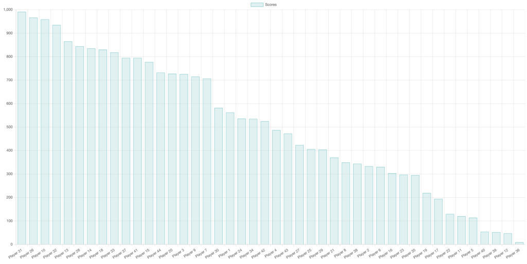
There’s no customization yet, just raw data in a white room. Let’s bring it to life with contrast, elegance, and a touch of fire.
Next, we’ll add a style.css file and make sure it’s properly linked in our HTML.
body {
    margin: 0;
    font-family: 'Segoe UI', sans-serif;
    background-color: #ffffff;
    color: #111111;
}

header {
    text-align: center;
    padding: 1.5rem 0;
    color: #000000;
    font-size: 2rem;
    font-weight: bold;
    letter-spacing: 1px;
}

.dashboard-container {
    max-width: 1200px;
    margin: 0 auto;
    padding: 2rem;
}

.main-content {
    display: flex;
    gap: 3rem;
    flex-wrap: wrap;
    justify-content: space-between;
    align-items: flex-start;
    margin-top: 1rem;
}

canvas {
    flex: 2;
    max-width: 700px;
    background-color: #fafafa;
    border-radius: 12px;
    padding: 1.5rem;
    box-shadow: 0 4px 12px rgba(0, 0, 0, 0.05);
}

.card {
    background-color: #fff;
    padding: 2rem;
    border-radius: 12px;
    border: 1px solid #e0e0e0;
    box-shadow: 0 4px 12px rgba(0, 0, 0, 0.05);
}

.leaderboard {
    flex: 1;
    min-width: 280px;
}

.leaderboard-entry {
    display: flex;
    justify-content: space-between;
    padding: 0.6rem 0;
    border-bottom: 1px solid #eee;
}

.rank {
    font-weight: bold;
    color: #ff2a2a;
}

.player-name {
    flex: 1;
    margin-left: 1rem;
    color: #111111;
}

.player-score {
    font-weight: bold;
    color: #111111;
}

h2 {
    color: #000000;
    border-bottom: 2px solid #ff2a2a;
    padding-bottom: 0.5rem;
    margin-bottom: 1.5rem;
}<!DOCTYPE html>
<html lang="en">
<head>
<meta charset="UTF-8">
<title>Player Dashboard</title>
<link rel="stylesheet" href="style.css">
<script src="https://cdn.jsdelivr.net/npm/chart.js"></script>
</head>
<body>
<div class="dashboard-container">
<header><h1>Game Analytics Dashboard</h1></header>
<div id="stats" class="card"></div>
<div class="main-content">
<canvas id="scoreChart"></canvas>
<div id="leaderboard" class="card leaderboard"></div>
</div>
</div>
<script src="main.js"></script>
</body>
</html>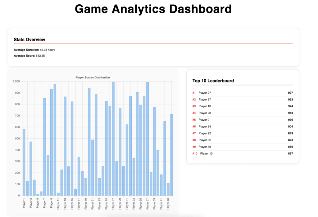
Now we have a dashboard that we can truly call a dashboard.
It’s simple to generate real-time charts with Chart.js, and you don’t need any additional skills if you already know JavaScript, HTML, and CSS.
Conclusion
Dashboards are cool, they show you everything you need in one place, and your data deserves beautiful dashboards to present it.
Presenting data becomes much easier with dashboards, and thanks to the JavaScript Chart.js library, you can make real-time updates while presenting.
You can easily customize the dashboard’s style and update your data using a simple JSON format. Moreover, you can create your own dashboards without any hassle.
This article is designed to get you started, nothing more.