
Multi-panel plots are a go-to tool for data analysts and scientists. Whether you’re comparing model outputs, segmenting behavioral trends, or tracking multiple time series, breaking a figure into subplots is often the fastest way to present a lot of information at once.
But there’s a catch: just because something fits on a page doesn’t mean it’s readable. Think of a newspaper without proper layout, it would confuse and exhaust readers instead of informing them.
This article walks through practical techniques using Python to transform cluttered multi-panel plots into clear, readable visual narratives. We’ll use layout hierarchy, axis management, and visual guidance to improve both design and communication.
The Problem with Default Grids
The standard approach to creating multi-panel plots is fast and functional but often flattens visual hierarchy.
plt.subplots(nrows=2, ncols=2)In the code above, every panel receives the same size, weight, and placement, regardless of its importance.
This often leads to repeated labels and ticks that create visual noise, no clear entry point for the viewer’s eye, disconnected panels without meaningful relationships, and difficulty extracting key takeaways, even when the data is strong.
Create Emphasis with Flexible Layouts
When everything looks the same, nothing stands out. To guide your audience, use layout tools like matplotlib.gridspec or subplot_mosaic to create structure that reflects the importance of each panel.
import matplotlib.pyplot as plt
import matplotlib.gridspec as gridspec

fig = plt.figure(figsize=(10, 6))
gs = gridspec.GridSpec(2, 3)

ax_main = fig.add_subplot(gs[:, :2])
ax_small1 = fig.add_subplot(gs[0, 2])
ax_small2 = fig.add_subplot(gs[1, 2])

ax_main.set_title("Main Metric Over Time")
ax_small1.set_title("Segment A")
ax_small2.set_title("Segment B")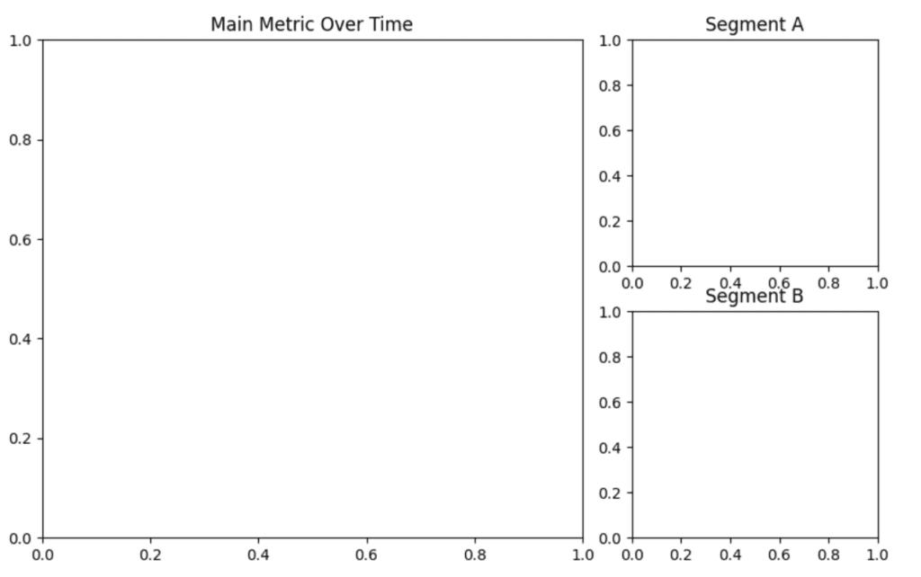
This layout immediately tells the viewer where to look first and how each subplot contributes to the overall story.
Simplify Labels with Shared Axes
A common source of clutter is repeated tick labels and axis titles. When panels share the same scale, use shared axes to reduce redundancy and emphasize comparison.
import matplotlib.pyplot as plt

fig, axs = plt.subplots(2, 2, sharex=True, sharey=True, figsize=(8, 6))

x = [1, 2, 3]

for i, ax in enumerate(axs.flat):
    y = [val + i for val in x]
    ax.plot(x, y, marker='o', linestyle='-', color='tab:blue')
    ax.set_title(f"Segment {i + 1}")
    ax.grid(True)

for ax in axs.flat:
    ax.label_outer()

fig.text(0.5, 0.04, 'Time', ha='center')
fig.text(0.04, 0.5, 'Value', va='center', rotation='vertical')

# Automatically adjust layout
plt.tight_layout()
plt.show()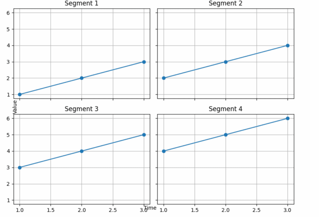
This technique enhances readability while reinforcing visual alignment across panels.
Guide the Viewer’s Eye with Flow
In most cultures, people read from left to right and top to bottom. You can mirror that natural reading pattern in your layout. Prioritize important panels by placing them where the viewer is likely to look first.
import matplotlib.pyplot as plt
from matplotlib.gridspec import GridSpec

fig = plt.figure(figsize=(9, 6))
gs = GridSpec(3, 3, figure=fig)

ax_main = fig.add_subplot(gs[0, :])
ax1 = fig.add_subplot(gs[1, 0])
ax2 = fig.add_subplot(gs[1, 1])
ax3 = fig.add_subplot(gs[1, 2])
ax_footer = fig.add_subplot(gs[2, :])

ax_main.set_title("Overall Trend")
ax1.set_title("Group A")
ax2.set_title("Group B")
ax3.set_title("Group C")
ax_footer.set_title("Weekly Summary")

# Auto-adjust spacing
plt.tight_layout()
plt.show()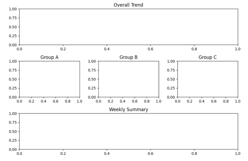
This structure flows naturally from overview to detail to summary, improving comprehension without explanation.
Use Titles and Annotations to Add Context
Every subplot should add to the story. Use descriptive titles and light annotations to explain what matters, without overwhelming the viewer.
import matplotlib.pyplot as plt

fig, ax = plt.subplots(figsize=(6, 4))

x = [1, 2, 3, 4, 5]
y = [10, 15, 13, 17, 22]
ax.plot(x, y)

ax.set_title("Engagement Spike After Launch")
ax.annotate("New feature released", xy=(3, 13), xytext=(2, 16),
            arrowprops=dict(arrowstyle="->", color='gray'))

ax.set_xlabel("Week")
ax.set_ylabel("Engagement Score")
Good annotations direct attention and make key moments in your data immediately clear.
Conclusion
Multi-panel visualizations are powerful tools for comparing complex data, but they only work when designed for readability. Default grids often create clutter and flatten meaning, making it harder for viewers to interpret what’s important.
By using Python libraries like matplotlib.gridspec, shared axes, thoughtful layout, and informative annotations, you can create figures that don’t just display data, they communicate insight. A well-designed multi-panel plot guides the eye, emphasizes the right details, and tells a coherent story.