We all love a good chart, don’t we? A clean line graph or a slick pie chart can make your data look polished and professional. But here’s the thing: using the wrong chart,even if it looks nice, can totally mess up how your data is interpreted.
Charts are powerful tools, but they can actually reduce readability if they don’t match the data. The way we present information can distort the message if we’re not careful. So let’s talk about something that doesn’t get nearly enough attention: choosing the right chart.
One Chart to Rule Them All? Not Quite
A bar chart isn’t always the best option. Neither is a pie chart. And please, don’t even get me started on the overuse of line graphs.
The truth is, no single chart is perfect for every situation. But because we tend to default to the same few types, we often end up twisting our data to fit the chart, instead of picking the chart that fits our data.
Bar Chart – The Reliable Workhorse
Bar charts are great for comparing different categories side by side. Super easy to read, and even easier to make.
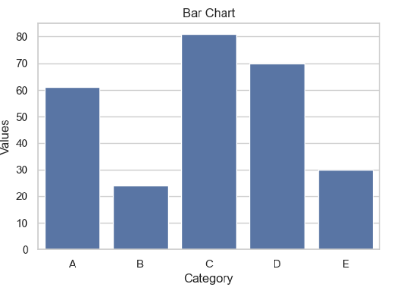
The best fit for a bar chart is comparing discrete categories, such as sales by product or population by country. However, using bar plots to show time trends or proportions of a whole, as well as numeric values, may not be the most effective choice.
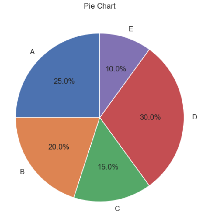
Pie Chart – Looks Good, Often Useless
While pie charts might look clean and visually appealing, they’re not always the best choice for precise reading. They can make it difficult to compare the sizes of different slices, especially when the differences are small. Instead, consider using alternative visualization methods, such as bar charts, which can provide clearer comparisons and make it easier for viewers to interpret the data accurately.
Line Chart – Best for Trends Over Time
Line charts connect the dots, literally. They’re perfect when you want to show how something changes over time.
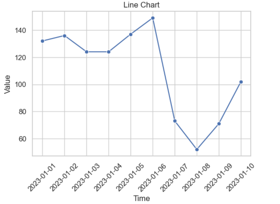
Line charts are your go-to for showing how things change over time. They work great for displaying temperature over days, stock prices by the minute, or growth over quarters. These charts highlight trends and patterns in data that flows in a sequence.
However, if your data isn’t sequential or continuous, it is best to steer clear of line charts. Using them in those situations can lead to some serious confusion.
Scatter Plot – Discover Relationships
If you’re exploring how two numeric variables relate, scatter plots are your best friend.
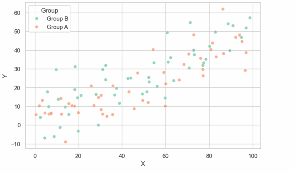
Scatter plots are perfect for finding correlations between two variables, such as study time and exam scores or age and income. They allow you to visualize the relationship between these variables and see how one may affect the other. However, scatter plots are not the best choice when you’re dealing with categorical data or when you need to show totals. In those cases, other types of charts may be more effective in conveying your message clearly.
Additionally, if you find that the dots in your scatter plot are too numerous and overlap, making it hard to discern their positions, hexbin plots can be a better choice. Hexbin plots group the data into hexagonal bins, providing a clearer view of the density of points in certain areas.
Histogram – Explore Distributions
Histograms show how data is distributed across intervals. They’re like bar charts but for continuous data.
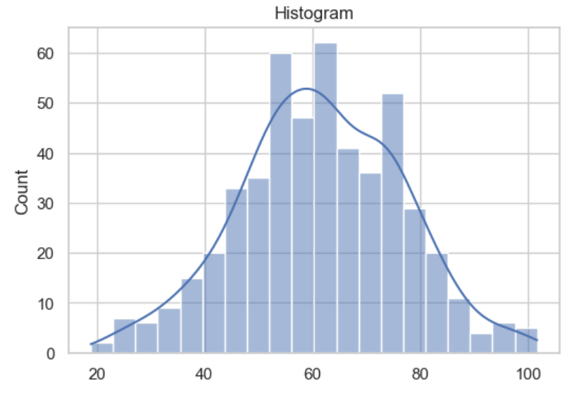
Histograms are great for analyzing the frequency of numeric variables, such as ages, salaries, or any other continuous data. They allow you to see how data is distributed across different ranges, making it easy to identify patterns and trends. However, histograms are not the best choice when you’re working with categorical data. In those cases, a bar chart would be a more suitable option to effectively represent the information.
Box Plot – Show the Spread
Box plots give you the five-number summary: min, Q1, median, Q3, and max. They also help you spot outliers.
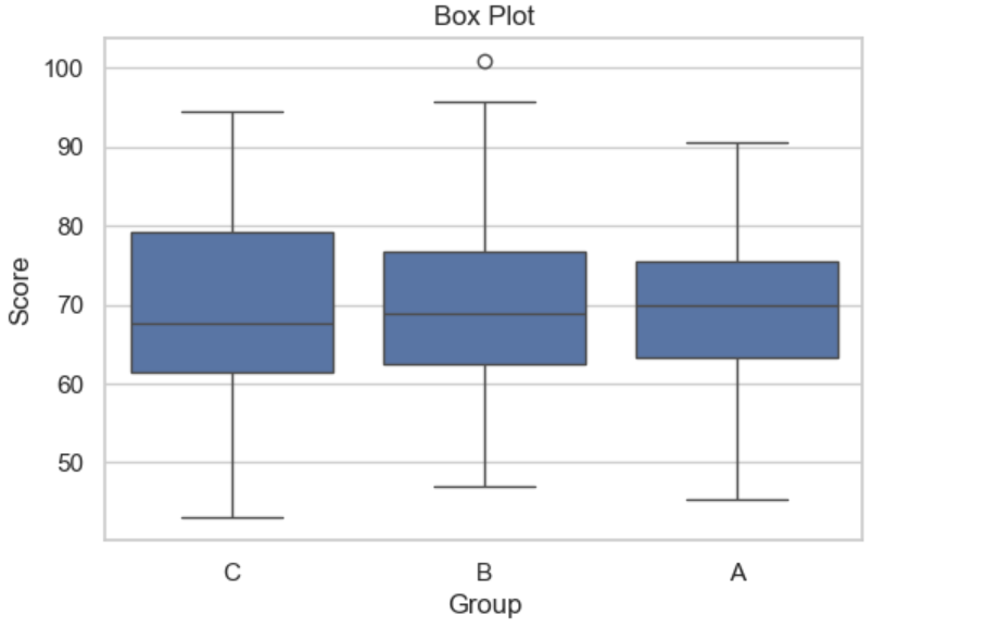
Box plots are useful for comparing distributions across different groups, such as test scores by class. They provide a clear visual summary of the data, highlighting the median, quartiles, and potential outliers, which can help in understanding the spread and central tendency of the data. However, it’s best to avoid using box plots if your audience isn’t familiar with them, as they can be a bit tricky for beginners to interpret. In such cases, opting for a more straightforward visualization method may be a better choice to ensure your message is easily understood.
Heatmap – Show Patterns, Not Precision
Heatmaps use color intensity to show values. Great for spotting patterns, but not for reading specific numbers.

Heatmaps are excellent for visualizing correlation matrices, calendars, or performance grids. They use color to represent data values, making it easy to spot patterns and trends at a glance. However, heatmaps are not the best choice when you need precise comparisons or when you have limited data. In those situations, other visualization methods may provide clearer insights and allow for more accurate analysis.
Area Chart – Like a Line Chart, but Filled
Area charts are basically line charts that are shaded under the line. They’re good for showing cumulative totals.
Area charts are great for showing total values over time, such as cumulative revenue or stacked areas for different categories. They effectively illustrate how values accumulate and change over a period. However, area charts should be avoided when you need to compare individual values clearly, as stacked areas can become messy and make it difficult to discern specific data points. In those cases, other chart types may be more effective for conveying your message.
Conclusion
In summary, choosing the right chart is essential for effectively conveying data. Each type; bar, pie, line, scatter, histogram, box plot, heatmap, and area chart, has its specific strengths and weaknesses.
Selecting the appropriate chart based on your data and the message you want to communicate can enhance clarity and prevent misinterpretation. A well-chosen visualization not only improves readability but also engages your audience, making your data insights more impactful. Always consider the best fit for your data rather than defaulting to familiar options.